I have developed shortcut methods I call my cut down methods. Using this idea I have several units I call "Blocks" The shortcut method or cut down method means you cut swatches of fabric. Sew them together and then cut out a square from the center. Saves time and effort and allows you to make intricate looking quilt blocks with easy steps. Great for beginners.
If you like this lesson you can find more Wings information and more original designs by me in my
EBook - Wings available for only $10 here - http://www.bitsnpiecesworkshop.com/
Click on the picture of the Wings Block and you will see a preview of some of the pages in the book.
so I was playing with a quilt block and I want to show you how you can take one Quilt Block and turn the blocks to make 13 differant looks with the same 16 "Blocks" this "Block" is made with my Wings Block.
You can find the directions for making this "Block" here
http://www.quiltingboard.com/t-60682-1
I send out 2 free acrlic templates to anyone who asks. A 2 1/2" and a 1 1/2". The Wings directions uses a 30 degree template also and that template is available for free upon request. Please send your address to patchesbyr@yahoo.com and please mention you saw it here on my blog. Thanks Rhonda
I have since developed paper templates(Not paper piecing) you can use in place of the 30 degree template.
http://www.quiltingboard.com/tutorials-f10/wings-block-swatch-alternative-t104927.html
http://www.quiltingboard.com/tutorials-f10/rhondas-wing-blocks-paper-template-tutorial-t106744.html
After I post all the quilt blocks and layouts I will show you how to take one quilt block and by changing colors you can make new looks just by using color in differant ways.
This is important to now so when you choose your fabrics you will have the look you want in your finished product. The way you use light dark and medium fabrics is very important. You have to be aware of how one plays againts another color. You need to decide if you want stong contrast or if you want the fabrics to blend together. So I will show you some examples of good choices and bad choices at least in my opinion!
Don't hesitate to ask if you have any questions! Thanks Rhonda
Block 4
Block 4 layout
This is the Wings Block. It looks hard but it isn't!! Once you learn to make these you can make all sorts of great patterns!
Block 1 The original quilt block I started with
Block 1 layout
Block 2 All I did was turn the blocks around
Block 2 layout
Block 3
Layout 3
Block 5 layout
Block 5 -- LOL this one makes me think of teeth! LOL
Block 6
Block 6 layout
Block 7
Block 7 layout
Block 8
Block 8 layout
Block 9
Block 9 layout
Block 10
Block 10 layout
Block 11
Block 11 layout
Block 12
Block 12 layout
Block 13
Block 13 layout
Now for the fun part!! LOL I love color!! So when you add color you gain a whole new world of possibilities.
Where you choose to put the colors and how you choose to layer color values or the differant hues of one color makes alot of differance in how your quilt block looks. You can choose large print or small print or anything in between. but the important part is how much differance there is betwee two colors that are close together. You can highlight a part of the quilt block or make part of it fade into the background depending on where you put color. So understanding the use of color in your quilt block will help you get a better looking quilt block in the end.
Here I will show you some of the ways I would use color and then I will show you some of the ways I think are not effective. But it is really all in your eye and what you want your quilt block to look like.
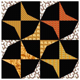
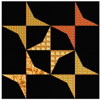
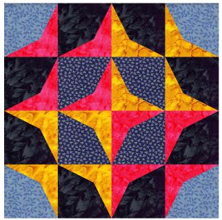
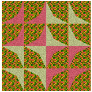
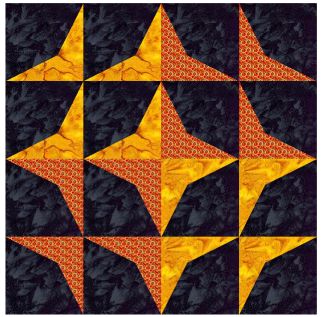
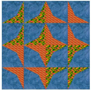
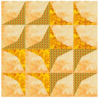
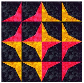
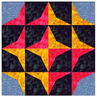
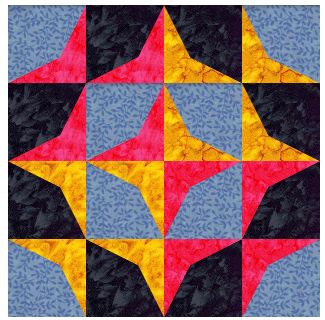
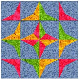
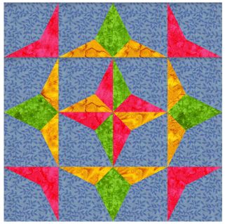
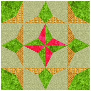
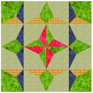
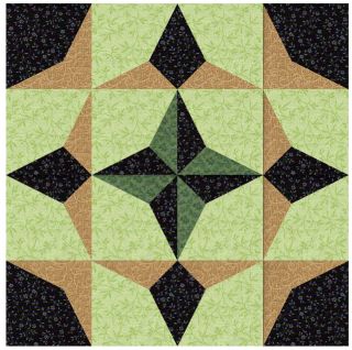
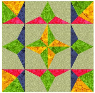
Look at Block 12 above, Here I chose to add differant colors in what I see as butterflies in this design.
Here is the same block but I used solid black in the two corners instead of the wing blocks
Here I used the same arrangement of
colors as above but I changed the center blocks to lt blue as well. This
has the effect of making the outer blue and the inner blue recede into
the background and makes the darker /brighter colors pop out more.If I
had used the same lt blue in the center it would have blended more with
the corner blues. As it is this color of blue makes the center blue step
down a bit but not all the way in the back ground.
These colors are ok but not anything to write home about in my opinion. But it is all in the eye of the beholder!!
This started as Block 3 above. Here I
decided to put two colors in opposite corners. I really like these
colors. They really make the design stand out!
This color choice is ok but I think it is only ok.
This one is acceptable but in my
opinion it all blends together too much for me. But if you were doing a
tone on tone type of quilt you might like this color set.
So here I went back to the black and used brights. Very effective for high contrast. May be too bright.
When you change dark to light you get a
diferant look to the quilt block You can direct the eye to differant
parts of the quilt block by where you choose to put the color and what
value of that color you use(light or dark etc) You can see I used
lilght blue in place of the black on the corners which made the
pink/yellow corners take on a differant look. They are now the outer
edge of the design instead of being in the middle of the design.
Here you can see the effect I was
talking about. This looks to me like the dark blue/pink/yellow lays
ontop of a lt blue background square.
This one look at the yellow and green in the middle of the sides.
Here I want you to see the sides where
the yellow and green were half and half. Now I changed the colors so the
yellow is at the bottom of those two blocks and the green is the center
like a diamond
Here is another color choice for this
quilt block. I want you to notice that the colors I used for the yellow
parts blend together,. Here I wanted to get the box like effect of those
parts of the quilt block so I used two colors that would blend. When I
used contrasting colors I didn't like it because it was too seperate
looking.
Here is the color combo I don't like,. The blue is too dark and is not a print fabric so it over powers the yellow print.
Ok LOL back to my original train of
thought! This is my favorite color arrangement for this block. I think
it is so elegant looking!
Here I used the dark pink with the dark
blue and they coexist much better as they are the same type of fabric.
In this case I want the box (the dk blue and dk pink lines make me
think of a box around the center design)to show up and if I use two
fabrics for it they need to play nice together. since I used the dark
pink I didn't want the dk pink in the middle. so I changed it to yellow
and wanted to show y ou how you can use two colors in the corner
blocks. If I use a color in the center then I need to bring that color
out somewhere else in the design. So I put it in the corners. It gives
it a 9 patch look if you look at only the yellow parts. 4 yellows on the
corners and the ones in the middle are 5 areas of yellow in the same
way as a 9 patch.
Ok Back to this block. I started with this block.
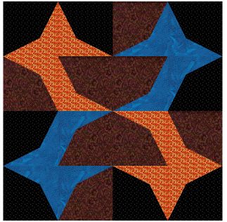
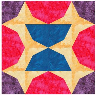
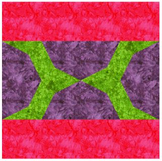
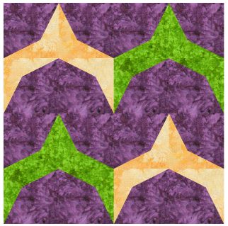
Ok now here is another train of thought I wanted to show you.
I hope you enjoyed the lesson!!! I will be posting more lessons soon!
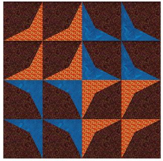
I started with this block
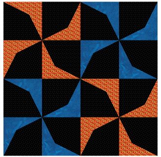
Then I turned the blocks to this quilt block
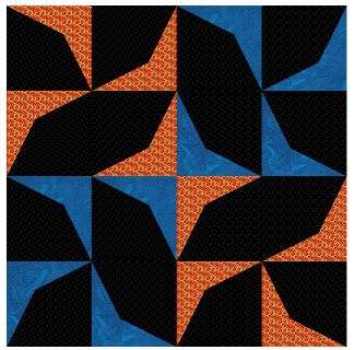
Then I turned the center blocks only to this pattern
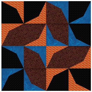
Now I saw the egg shaped areas in the center and thought I would change the colors there. But I didn't like the looks of it.
I turned the blocks again but this is really one I DON"T like!!! This one is not a good one to use at all!!!
Here is another color choice for this block but it still isn't one I would use.
Here I turned the top row and the
bottom row dk pink and the lt yellow I turned it green. These look like
space ships to me! The kind they had in asteroids - one of the old
arcade games
Space ships anyone?? LOL I do think this one would make a great space ship quilt for a kid!!
I hope you enjoyed the lesson!!! I will be posting more lessons soon!


No comments:
Post a Comment