Welcome to my second Boston Block Hotpad Class
In this lesson we are going to discuss fabrics and colors. This is only in regard to my designs. For other projects you may want to blend your colors and do other treatments.
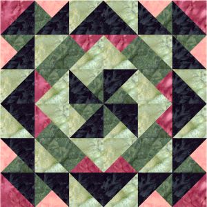
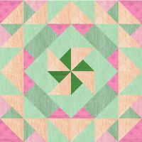
This is the quilt block we are going to make
Of course 100% cotton is the best choice as far as the type of fabric to use.
Whether you use batiks or civil war fabrics or country prints is all up to you and what you like.
However to make a design stand out and be noticed you need to pick your type of prints or batiks etc carefully.
When I design I use alot of contrast in my colors. This makes certain areas of the design stand out. So choosing the right color combinations will affect how your finished product looks.
I know alot of people are not comfortable with choosing colors. So I'm going to give you some basics to use as a guideline.
Colors break down into different values:
as you can see this starts light and gets a big darker as it goes til you reach the dark values.
Light

Light with a print
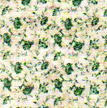
Light Medium
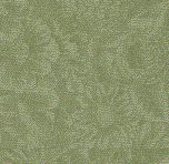
Medium
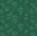
Light Dark
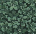
Dark
Look at the design you want to make and see how many different colors you will need. In this quilt block I have designed you will see 5 different colors.
You will need to choose:
a light background - light enough so the colors show up against it.
a medium red - Make sure it isn't too light
a light red/pink - It needs to show against the background color
a medium green -This should be not quite dark but not too light either
a light green - light enough to show against your medium but not blend with the background
You don't want to let your colors blend. To get the right look you need to choose fabrics that you can see seperately when they are laid side by side. If you have 2 shades of yellow and you lay them together you should have strong different values.
You can also achieve a contrast by using fabrics that are different as in say one is a large check pattern and the other one is a leaf pattern.
Here are some examples of what not to do:
This one is too light and blends too much together
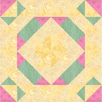
This one has been split into too many different colors
It's too busy looking. If you want to make it a scrappy
then make it all a scrappy look keeping the values in mind
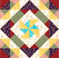
This one could be okay but for me it is too much the same values
It doesn't stand out as well as it could if you used different values.
-----------------------------------------------------------------------------------------------
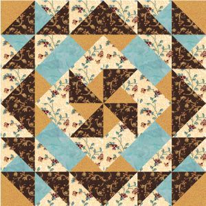
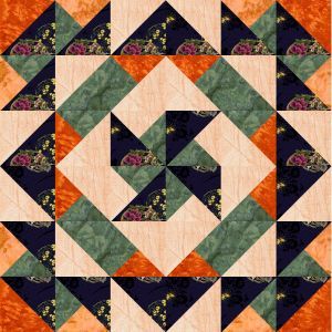
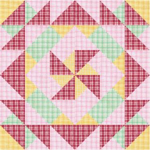
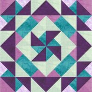
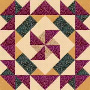
Okay now here are some good color combinations. They all use strong contrast so the design will stand out.
You can easily see each individual color apart from the others.
Whatever color combinations you like make sure they all stand apart.
Of course we all know about the color wheel and if you look up one online you can see what the opposite colors are. Red is opposite of Blue etc. Keep this in mind when you choose your colors.
Fabric amts you will need:
Red a strip 3" x 8"
Pink a strip 3" x 6"
Light Green a strip 3" x 33"
Med Green a strip 3" x 21"
Dark a strip 3" x 24"
2 short borders - 2" x 7"
2 long borders - 2" x 9"
Backing will need to be about 9" square
I use poly batting - traditional which is really dense
and I cut two layers.
If you prefer to use insulbrite feel free to use whatever you are comfortable using.
You will also need a loop. I use a new shoelace and cut a length about 2 1/2" long.
I don't use binding so that won't be a part of this project.
